
What the Fear & Greed Index Tells Us About Market Returns
Should you "buy the fear and sell the greed"? A Python-based deep dive.

👉👉👉 GET THE PYTHON NOTEBOOK for the full analysis in this post here.You’ve probably heard of CNN’s Fear & Greed Index — a tool that measures market sentiment on a scale from 0 (extreme fear) to 100 (extreme greed).
Thanks for reading Code Meets Capital!
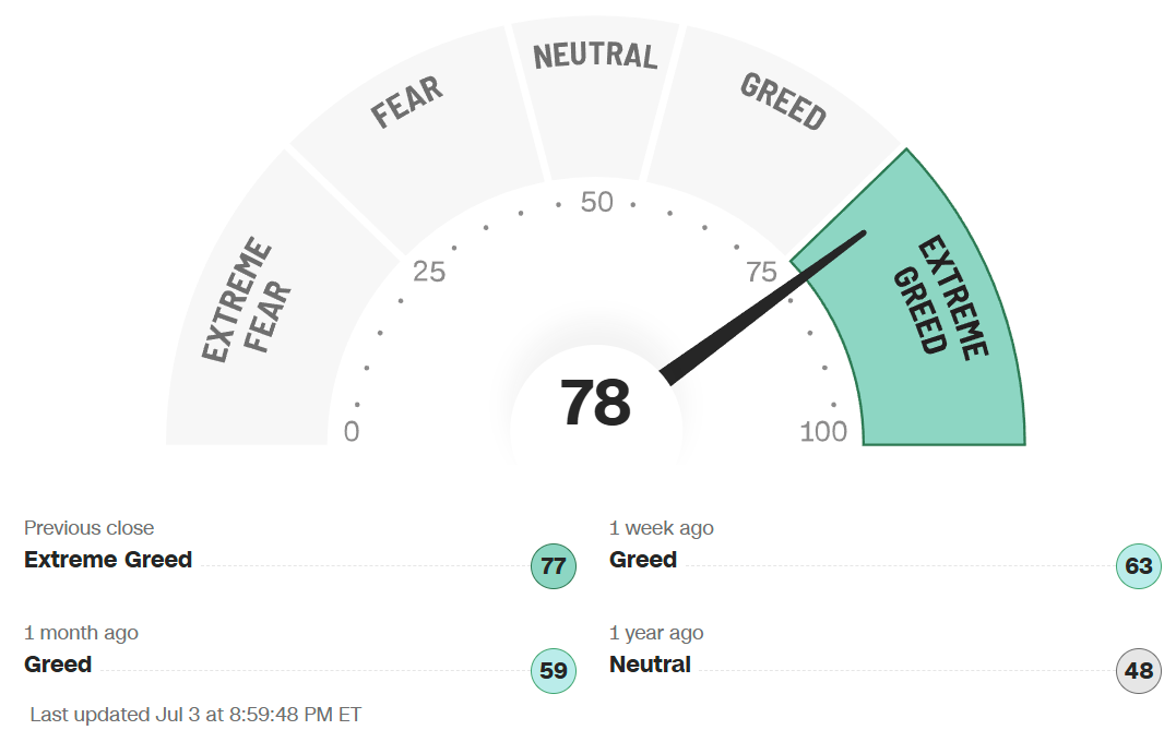
We all remember when this index plunged to a low of 4 back in April, flashing Extreme Fear as Trump’s “Judgement Day” sent stocks tumbling. But in just a few months, sentiment has flipped — today, the needle sits at 78 (Extreme Greed) for the first time in 12 months. How quickly the tables turn!
As CNN puts it: “Many investors are emotional and reactionary… fear and greed sentiment indicators can alert investors to their own emotions and biases.
“Buy the fear and sell the greed.”
I’m pretty sure you have heard of the old contrarian mantra: “Buy the fear, sell the greed.” But what does it really mean? Should we actually follow it?
What does the fear and greed index tells us about market returns?
To answer this, I ran a Python-based analysis using data from 2011 onward (when the index was launched). I grouped the index into deciles and measured how the market performed after each sentiment level — over horizons ranging from 1 day to 3 years. I also charted the SPY prices together with the Fear and Greed Index on the same timeline. Let’s dive right in.
Import Libraries
First, we import the necessary libraries for data acquisition, data wrangling and plotting.
# for data wrangling
import pandas as pd
from datetime import datetime

# for plotting and visualizations
import plotly.express as px
from matplotlib import rcParams
import matplotlib.pyplot as plt
import seaborn as sns
sns.set_theme() # to make the seaborn plots nicer

# for coloring heatmap
from matplotlib.colors import LinearSegmentedColormap
from matplotlib.colors import TwoSlopeNorm

# For parsing data from financialmodelingprep api
import os
import requests, csv, json, urllib
from urllib.request import urlopen
import json

def get_jsonparsed_data(url):
    response = urlopen(url)
    data = response.read().decode("utf-8")
    return json.loads(data)
Data Sources
These are the URL for our data sources for both the historical fear & greed index, and the market returns.
# Financial Modeling Prep API url to obtain market returns data
fmp_base_url = "https://financialmodelingprep.com/api/v3/"

# CNN url for obtaining newer fear greed index data
cnn_base_url = "https://production.dataviz.cnn.io/index/fearandgreed/graphdata/"

# for obtaining older fear greed index data
# credits to Part Time Larry: https://github.com/hackingthemarkets
old_fear_greed_csv_url = 'https://raw.githubusercontent.com/hackingthemarkets/sentiment-fear-and-greed/refs/heads/master/datasets/fear-greed.csv'
Get Older Fear & Greed Index Data from Part Time Larry’s GitHub
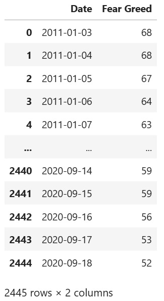
The fear and greed index data from CNN itself does not date back all the way to 2011 when the index was first created.
Fortunately, I found a set of older fear and greed index data from Part Time Larry’s Github. (Exact link to the dataset here. Thank you Part Time Larry!) Here we obtain the data, store it locally and display it.
df_index_old = pd.read_csv(old_fear_greed_csv_url)
df_index_old.to_csv('old_fear_greed.csv')
df_index_old = pd.read_csv('old_fear_greed.csv')
df_index_old = df_index_old[['Date', 'Fear Greed']]
df_index_old
We see that the data dates back to 2011 but stops at 2020.
Get Newer Fear Greed Index Data from CNN
The more recent data can be obtained from CNN itself as shown.
start_date = "2020-09-19" # 1 day after last day of data in Part Time Larry's GitHub
headers= {'User-Agent': 'Mozilla/5.0 (Windows NT 6.1; WOW64; rv:20.0) Gecko/20100101 Firefox/20.0'}
r = requests.get(cnn_base_url + start_date, headers = headers)
data = r.json()

df_index_new = pd.DataFrame(data['fear_and_greed_historical']['data'])
df_index_new.head()
Column x is actually the timestamp while column y is the fear & greed index itself. Let’s turn the timestamps into a human readable one, then combine it with the older fear and greed index data into a single dataframe.
df_index_new['x'] = df_index_new['x'].apply(lambda x: datetime.fromtimestamp(x / 1000).strftime('%Y-%m-%d'))
df_index_new = df_index_new.rename(columns = {'x': 'Date', 'y': 'Fear Greed'})
df_index_new = df_index_new.drop_duplicates()
df_index = pd.concat([df_index_old, df_index_new])[['Date', 'Fear Greed']]
df_index['Date'] = pd.to_datetime(df_index['Date'])
df_index = df_index.set_index('Date')
df_index
Bin the Data Into Deciles
rcParams['figure.figsize'] = 5, 3
df_index.plot.hist(bins=10, xlabel = 'Value of Fear & Greed Index')
Unsurprisingly, most of the time the sentiment of the market is somewhat neutral, so the index tends to cluster around the middle ranges. Only in times of extreme paranoia or optimism will the index go towards 0–20 or 80–100.
Let’s now add a column to label the data into their respective fear & greed deciles.
bins = [0, 10, 20, 30, 40, 50, 60, 70, 80, 90, 100]
labels = ['0-10', '11-20', '21-30', '31-40', '41-50', '51-60', '61-70', '71-80', '81-90', '91-100']
df_index['fear_greed_bins'] = pd.cut(df_index['Fear Greed'], bins, labels=labels, include_lowest = True)
Obtain Historical Market Data (SPY) from Financial Modeling Prep API
Historical market data (SPY) can be obtained from the Financial Modeling Prep API for free. You need to sign up for an account here to get an API key (250 requests per day for the free tier). After signing up, your API key will be shown on the dasbboard.
Enter your API key in the next cell to store it in the environment variable “FMP_API_KEY”. In the following cell, we will then get the API key from the environment variable to use for our requests later.
os.environ['FMP_API_KEY'] = "YOUR_API_KEY"Here, we obtain the historical data for SPY, starting from the earliest date in the fear & greed index data (i.e. 2011–01–03). We also parse the dates and set it as the index.
apiKey = os.environ['FMP_API_KEY']
ticker = "SPY"
earliest_date = df_index.index[0] # we extract data from the earliest date in our fear greed index data
earliest_date_string = earliest_date.strftime('%Y-%m-%d')
url = f"{fmp_base_url}historical-price-full/{ticker}?from={earliest_date_string}&apikey={apiKey}"
df_prices = pd.DataFrame(get_jsonparsed_data(url)['historical'])
df_prices['date'] = pd.to_datetime(df_prices['date']) # parse dates and set as index
df_prices = df_prices.set_index('date')
df_prices.head()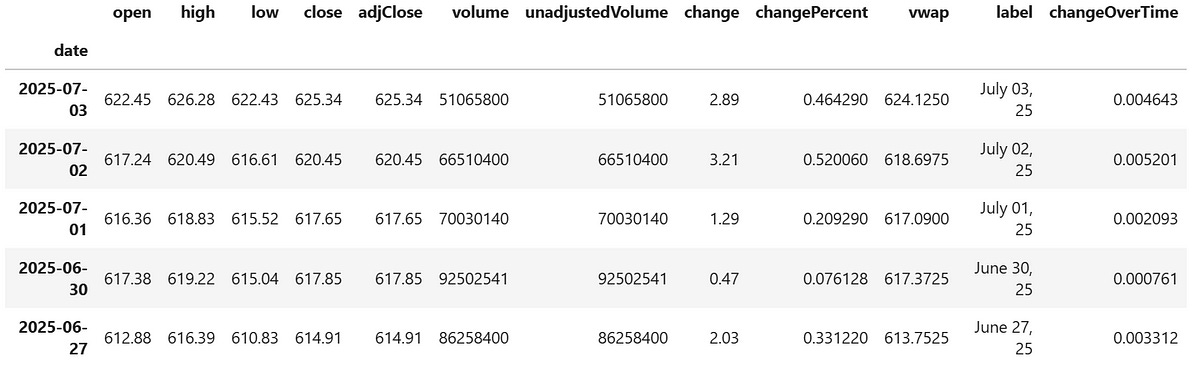
Calculate Returns for Different Time Periods
In the code below, for each date we look ahead at the Adjusted Close Price of SPY over different time periods ranging from 1 day to 3 years, and calculate the percentage returns.
timediff = {
    '1_day': 1,
    '1_week': 5,
    '1_month': 21, # 1 month has ~21 trading days
    '3_month': 63,
    '6_month': 126,
    '1_year': 252,
    '3_year': 756,
}

return_cols = [f'{x}_returns (%)' for x in timediff.keys()]

for label, shift_days in timediff.items():
    df_prices[label] = df_prices.shift(shift_days)['adjClose']
    df_prices[f'{label}_returns (%)'] = (df_prices[label] - df_prices['adjClose'])/df_prices['adjClose'] * 100 # in percent

df_prices[return_cols]
Some of these returns are shown as NaN in the most recent dates. Don’t worry, this is because there is not enough data to look ahead and calculate the future returns. (I would surely love to know what these returns are!)

Merge Market Returns with Fear & Greed Index Data
Now let’s merge the forward market returns with the corresponding fear & greed data. We now have the complete dataset to begin our analysis!
df = df_index.merge(df_prices[return_cols],
                       left_index = True, right_index = True, how = 'left')

df.head()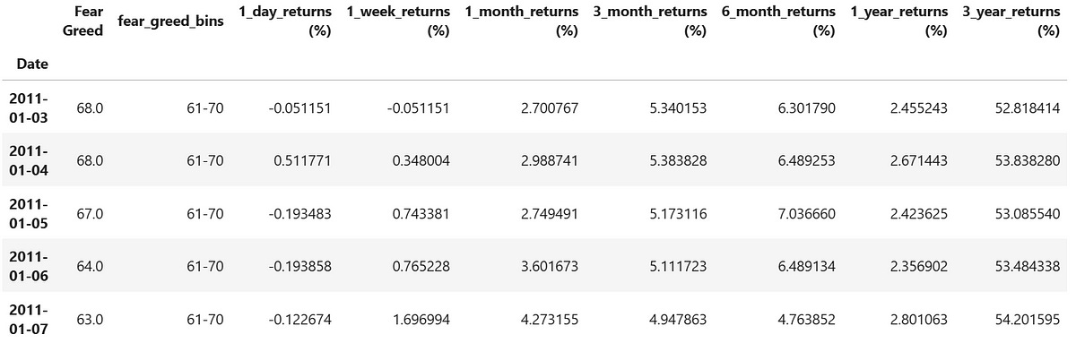
Strip Plots of Historical 1 Day to 3 Year Market Returns vs Fear Greed Index
Instead of diving straight into the average returns for each fear & greed bin, it is useful to plot these returns on strip plots.
Strip plots allow us to visualize the distribution of a categorical variable (the bins) vs a numeric one (the returns). It also allows us to see the range and clustering of outcomes within each sentiment level.
Here we plot these returns for every fear & greed bin, with separate charts showing various look-ahead periods ranging from 1 day to 3 years. We are using this as a visual guide to help us see what kind of returns investors typically experienced after buying during periods of fear or greed from 2011 to 2025.
# figure size in inches
rcParams['figure.figsize'] = 8, 5

for label in timediff.keys():
    sns.stripplot(data=df.reset_index(), x='fear_greed_bins', y=f'{label}_returns (%)', hue='fear_greed_bins')
    plt.xticks(rotation=-45)
    plt.show()
Short Term Returns (1 day to 1 week)


Returns in the short term (both 1-day and 1-week) are highly volatile during periods of extreme fear, as shown by the wide scatter of returns where the fear and greed index is below 20. In some cases, we are seeing swings greater than ±10% in just 1 week or even 1 day, reflecting just how turbulent these market environments can be in the short term. It sure seems like a very uncertain period to invest in!
By contrast, returns tend to be much more stable during periods of extreme optimism (index above 80). The returns are way more clustered together and the market behaves more predictably, at least in the short run.
Short to Medium Term Returns (1 month to 3 months)


As the holding period extends to 1 — 3 months, we begin to see a noticeable skew toward higher returns following periods of extreme fear (index < 20). These clusters of strong performance often represent relief rallies or the early stages of a market recovery, when panic selling has subsided and buyers begin stepping back in.
In some cases, we even observe 3-month returns exceeding 30% (wow!), this shows that rebounds from extreme pessimism can be sharp and powerful. BUT achieving such outsized returns typically requires buying very close to the bottom — something few investors can do consistently.
Timing the exact bottom is of course notoriously difficult, and only a handful of points show such high returns corresponding to buying at the bottoms. It is however worth noting that in the charts above these points almost always fall within periods of extreme fear (we see points with > 20% returns mostly in the two lowest fear and greed bins in the 3 month returns plots, with a few points in the third lowest bin).
On the flip side, we see a gradual erosion of returns follow periods of higher optimism (higher fear & greed index bins). Particularly when the fear and greed index is above 80, while prices may still drift higher during these times, the risk of a short to medium term correction increases, so the short to medium term return profile is in some cases quite negative, as shown in the 3 month returns plot within the two highest fear and greed bins.
Medium to Long Term Returns (6 months to 1 year)


In the medium to long term (6 months to 1 year), we continue to see a skew toward higher returns following periods of extreme fear (index < 20) like in the previous case. In fact, if you bought during the lowest fear and greed bin, you would almost certainly be in the green after 1 year, with just 3 data points below 0% returns in the graph above.
But wait!
The performance decay when buying during extreme greed (index > 80) did not continue. Shouldn’t those be the worst like in the 3 month return plot, especially if we take sentiment as a contrarian signal and “sell the greed”? If only it were that simple.
Although extreme greed can often lead to pullbacks (as seen earlier), this are usually short lived. Markets can stabilize and recover in the medium to long term, especially in strong bull cycles such as that between 2011 and 2025. By the time the 6-month return is measured, the initial dip may have already bounced.
Furthermore, many extreme optimism (index > 80) periods happened mid-rally, not right at market tops or right before market crashes. Especially in a prolonged bull market that keeps running, the next 6 months following periods of extreme greed can still deliver modestly positive returns, despite short term pullbacks.
We will look at this more closely when we plot out the price chart of SPY together with the fear and greed index.
What about the middle sentiment bins?
Interestingly, the middle sentiment bins tend to show the most mixed outcomes in the middle to long term, with these returns evenly scattered across both impressive gains and disappointing losses.
These bins often occur during market indecision, which can lead to rather long stretches of choppy, sidways consolidation, failed breakouts, or slow-motion corrections. If you look closer, the return distributions in each bin are actually still skewed positive as markets do tend to move up over time. In a few cases, market tops can happen within these middle sentiment bins, as we will see below.
There’s another anomaly worth noting!
If you’re sharp-eyed, you may have spotted a dip in performance in the 11–20 sentiment bin on the 1-year return chart. Unlike the usual trend where lower sentiment leads to higher long-term gains, this bin stands out with relatively weaker 1-year returns. So what happened?
As we’ll see in the SPY chart later, many of these 11–20 readings coincided with the drawn-out 2022 bear market. Each time sentiment dropped to these levels, it aligned with one of several sharp selloffs, but the pain didn’t end there. Each recovery attempt was met with even lower lows, stretching the period of market distress for nearly a year. Investors who bought in these windows didn’t get the full benefit of a 1-year rebound, they were stuck in a prolonged storm.
This is a powerful reminder that “low” can still go lower in the short to medium term, especially during extended downturns. But does this mean we should avoid buying at these low-sentiment bins? We will answer this right below when we look at the long term returns.
Long Term Returns (3 Year)
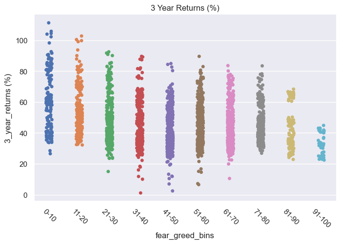
The good news? In the plot above you can see that all long term returns (of 3 years) from 2011 until now are positive, no matter when you invest. That’s the long term power of the equity market.
We now see a stronger skew toward higher long-term returns when buying during periods of extreme fear (index < 20). Even the apparent weakness (the anomaly) we saw in the 11–20 sentiment bin on the 1-year return chart has fully recovered by the 3-year mark, on average outperforming the higher sentiment bins. This suggests that, while short-to medium-term underperformance may shake your confidence, these fearful entry points often ultimately become excellent buying opportunities if you’re willing to be patient.
We also continue to see that even high sentiment bins (index > 80) deliver positive outcomes in the long term, though the returns tend to flatten out and exhibit much less volatility.
But where are the major market tops?
Let’s look at the middle sentiment bins. Here we start to see a few cases where 3 year returns fall short (i.e. the few points below 20% returns in the plot above). Why?
Because many major market tops and turning points begin quietly in this range — when optimism is cooling, but fear hasn’t yet taken hold. Bullish momentum fades, breadth narrows, and cracks begin forming beneath the surface, escaping detection. These zones often precede failed rallies, bull traps, or bear market bounces that eventually roll over — such as what happened during the 2022 bear market, which we’ll explore later in the SPY and fear greed index charts.
It’s also worth noting that these market tops — the ones that occur during middle sentiment ranges — are relatively rare in the data. Only a handful of points in the middle bins show truly disappointing 3-year returns, signalling days which were near the top.
Furthermore, these points are scattered throughout a very wide range of sentiment levels. So while it’s tempting to try and “sell before the crash,” the data reminds us: Tops are subtle, scattered, and not reliably predicted by sentiment alone. Even if you suspect a market top is forming, it’s incredibly hard to time your exit.
Charts for Both SPY and Fear Greed Index
To put things into perspective, let’s now plot and overlay the SPY price chart and the Fear & Greed Index on the same timeline. We’ll highlight periods of extreme fear (index < 20) in red, and extreme greed (index > 80) in green.
# for plotting
df_plot = df_index.merge(df_prices['adjClose'],
                       left_index = True, right_index = True, how = 'left')

rcParams['figure.figsize'] = (12, 14)

# 3 subplots, 2 for SPY, one for Fear Greed Index
fig, (ax1, ax2, ax3) = plt.subplots(nrows=3, sharex=True,
                                    gridspec_kw={'height_ratios': [3, 3, 1]})

# SPY with Red Highlight (< 20)
sns.lineplot(data=df_plot, x=df_plot.index, y='adjClose', ax=ax1, color='blue', label='SPY')
for i in range(len(df_plot) - 1):
    fg = df_plot['Fear Greed'].iloc[i]
    if fg < 20:
        x_start = df.index[i]
        x_end = df.index[i + 1]
        ax1.axvspan(x_start, x_end, color='red', alpha=0.05)
ax1.set_ylabel('SPY Price')
ax1.set_title('SPY with Fear & Greed < 20 Highlighted')
ax1.legend(loc='upper left')


# SPY with Green Highlight (> 80)
sns.lineplot(data=df_plot, x=df.index, y='adjClose', ax=ax2, color='blue', label='SPY')
for i in range(len(df_plot) - 1):
    fg = df_plot['Fear Greed'].iloc[i]
    if fg > 80:
        x_start = df_plot.index[i]
        x_end = df_plot.index[i + 1]
        ax2.axvspan(x_start, x_end, color='green', alpha=0.05)
ax2.set_ylabel('SPY Price')
ax2.set_title('SPY with Fear & Greed > 80 Highlighted')
ax2.legend(loc='upper left')


# Fear & Greed Index
sns.lineplot(data=df_plot, x=df_plot.index, y='Fear Greed', ax=ax3, color='orange')
# Add lines at 20 and 80
ax3.axhline(20, color='red', linewidth=1, alpha=0.6)
ax3.axhline(80, color='green', linewidth=1, alpha=0.6)
ax3.set_ylabel('Fear & Greed')
ax3.set_xlabel('Date')
ax3.set_title('Fear & Greed Index')

plt.tight_layout()
plt.show()
Periods of extreme fear (red bands)
As the first chart above shows, periods of extreme fear tend to coincide with major market bottoms. These red zones often appear near cyclical lows — when investors panic, volatility spikes, and often, prices recover soon after.
This explains why, in the strip plots earlier, the best and most extreme forward returns across almost all timeframes consistently came from the lowest sentiment bins.
Of course, recovery may not always be immediate, especially during longer bear markets. Take 2022 in the chart for example, the market experienced multiple sharp drops for a prolonged period, each triggering a plunge in the Fear & Greed Index as shown by the multiple red bands marked throughout that year. These periods often saw short-term bounces, but they were quickly followed by even greater renewed selling.
The broader bear market dragged on for months, and a true recovery didn’t materialize until well into 2023 after more than a year. Yet even so, these fear-driven signals often offer attractive entry points when viewed from a long-term perspective.
This also explains why, the strip plots earlier show strongly skewed positive returns for the low-sentiment bins over the longest term period of 3 years, even though there was a dip in performance for one of the low sentiment bins during the 1 year return period.
Periods of extreme greed (green bands)
While periods of extreme fear (Fear & Greed Index < 20) tend to coincide with major market bottoms, periods of extreme optimism (index > 80) do not reliably mark market tops.
In fact, as the second chart above shows, they hardly coincide with any major market tops between 2011 and 2025 (though one of these green bands was close to the top before the covid crash).
Moreover, in the months leading up to the major bear market in 2022, not a single green band appeared.
This explains why, in the strip plots earlier, the points with low returns (corresponding to buying at the top) are mostly scattered across middle sentiment bins, not the top bins.
The green bands representing extreme greed are scattered throughout the middle of ongoing bull runs. While we notice dips in the market after some of these green bands, these are often short term pullbacks. In fact, markets often continue rising in the months that come after these pullbacks.
This explains why, in the strip plots earlier, the highest sentiment bins showed some negative returns in the short-term (3 month) chart, but these negative outcomes mostly disappeared over longer holding periods like 6 months to 3 years.
This suggests that the Fear & Greed Index functions best as a contrarian buy signal during panic, but should be used with caution, or not at all, as a sell signal during extreme greed.
Summary Heatmap (Median Returns vs Fear and Greed Index)
rcParams['figure.figsize'] = 8, 5
df_median = df.groupby('fear_greed_bins').median() # calculate the median for each decile
df_median_returns = df_median[return_cols]
df_median_returns = df_median[return_cols]

# we use this scaled_df to color the heatmap below, the coloring is scaled across each column
# as it is more meaningful to color the returns relative to other returns within the SAME PERIOD
scaled_df=df_median_returns/df_median_returns.max()
rdgn = sns.diverging_palette(h_neg=10, h_pos=130, s=99, l=55, sep=3, as_cmap=True)
divnorm = TwoSlopeNorm(vmin=-1, vcenter=0, vmax=1)
sns.heatmap(scaled_df, annot=df_median_returns, cbar=False, cmap=rdgn, norm=divnorm)
plt.yticks(rotation=0)
plt.title("Median Returns vs Fear Greed Bins")
plt.show()
Let’s end off with a summary heatmap which shows the median forward returns across the different fear and greed bins, as well as the different time periods we discussed. (I did not use mean returns as they are more sensitive to the extreme values we saw in the strip plots).
We observe that
When fear is extreme (top row of heatmap), returns are skewed higher — rather consistently across all time horizons, with the slight exception of the 1-year return horizon, where we earlier observed some weakness in the lower sentiment bin due to the prolonged 2022 bear market.
This 1-year horizon anomaly, however, fades in longer timeframes of 3 years, where returns become very strongly skewed higher for the lowest sentiment bins (rightmost column of heatmap) — reinforcing the fact that fearful entry points often become excellent buying opportunities if you’re willing to be patient.
When greed dominates, short-term returns may suffer due to pullbacks, but longer-term outcomes remain positive — though more modest.
Middle sentiment zones are a bit noisier. These are the hard zones: sideways markets, failed rallies, slow fades, with the occasional market tops scattered all over within these zones.
So should we buy the fear and sell the greed?
Buying During Fear
Extreme fear (captured by fear and greed index below 20) consistently delivers the best payoffs and ultimately, signals the best long-term buying opportunities.
Works best with a long holding period. Even in 2022, where fear persisted, patient investors were strongly rewarded after a couple of years.
Requires emotional resilience. These periods often come with extreme volatility like we have seen in the strip plots, and scary headlines screaming “This time it is different!”. The best opportunities never feel comfortable.
Should you do it?
Yes if you have a long enough holding period (ideally multi-year), you can withstand near-term volatility, and you understand it’s a probabilistic edge, not a guarantee.
No if you need certainty that the market will recover in x months/years because you need the cash soon — cheap can get cheaper first.
Extreme Fear pays well…if you give it time.
Selling During Greed
Is unreliable. While extreme optimism (captured by fear and greed index above 80) does precede short-term pullbacks or flattening performance, it doesn not reliably signal tops at all. That’s because many high-sentiment readings happen mid-rally, not right before a crash.
Might make you miss entire bull cycles and years of compounding. Selling purely based on optimism while waiting for periods of extreme fear (which are rare to begin with) could mean missing out on significant gains as the bull continues to run — bull markets can last way longer than you would expect.
As of writing, the Fear and Greed Index reads “Extreme Greed”.
This doesn’t mean a crash is imminent — so don’t rush to sell just because sentiment is high.
The saying “be fearful when others are greedy” still holds, but it more aptly applies towards individual hyped-up and narrative-driven growth stocks, not broad indices like SPY.
And it should never be taken as a mechanical sell signal based on a Fear and Greed index level alone. Markets can remain in a state of optimism for extended periods, and selling prematurely often means missing out on significant gains.
⚠️ Caveats & Regime Awareness
Unfortunately, the Fear & Greed Index only dates back to 2011, so we can’t include earlier periods.
If this dataset had included events like the Dot-Com Bubble (2000–2002) or the Global Financial Crisis (2008–2009), and the lost decade from 2000 to 2010 — we might have observed more longer-tailed drawdowns and delayed recoveries.
We may likely see even more exaggerated low returns during fear, followed by some of the most outsized recoveries, and perhaps with more gut-wrenching volatility along the way.
Although this study refers to “short-to-medium term pullbacks” as lasting for around 3 months, and “prolonged” bear market as lasting for a year in 2022, that only holds true in the relatively benign post-2011 environment.
In prolonged depressed markets, “short-term” pullbacks can easily stretch beyond 3 months, and sometimes even years, while a “prolonged” bear market can stretch even longer.
Another Caveat for the Statistically Inclined
In the strip plot charts above, I calculated forward returns (like “what happened 3 months later?”) for every single trading day — so there are lots of dots. That means some of the returns shown are based on overlapping time periods. For example, a return from Jan 3 to Apr 3 and another from Jan 4 to Apr 4 are almost the same — just shifted by one day.
So while the charts may look like they have thousands of separate results, many of them are based on similar stretches of time. This means the data points are not fully independent, and traditional statistical assumptions like independence or IID don’t hold. As a result, any patterns you see — while visually compelling — shouldn’t be interpreted as statistically significant without proper adjustments (e.g., clustered standard errors or bootstrapping).
That said, I’m not running statistical tests or claiming significance here — this is meant to be an exploratory visual guide to help you see what kind of returns investors typically experienced after buying during periods of fear or greed.
Animated Scatter Plot of Returns vs Fear Greed Index
Here’s a fun one. If you’d like a more interactive, visual way to explore how returns behave across the different sentiment levels and time horizons, I’ve included a small snippet of code for an animated scatter plot.
rcParams['figure.figsize'] = 14, 12
fig = px.scatter(df_stack, x="Fear Greed", y="returns", animation_frame="period",
           color="fear_greed_bins", range_x=[0, 100], range_y=[-40, 130])
fig.update_layout(
    height=600, xaxis_title='Fear Greed Index', yaxis_title='Returns',
    title="Historical 1 Day to 3 Year Market Returns vs Fear Greed Index"
)
fig.show()
👉👉👉 GET THE PYTHON NOTEBOOK for the full analysis in this post here.Coming Up:
In an upcoming post, I’ll use the Fear & Greed Index as a trading signal in a backtest just so we see what happens. :)
Subscribe below so you won’t miss that — or any other future similar deep-dives built for you!
Cheers,
Damian
Code Meets Capital